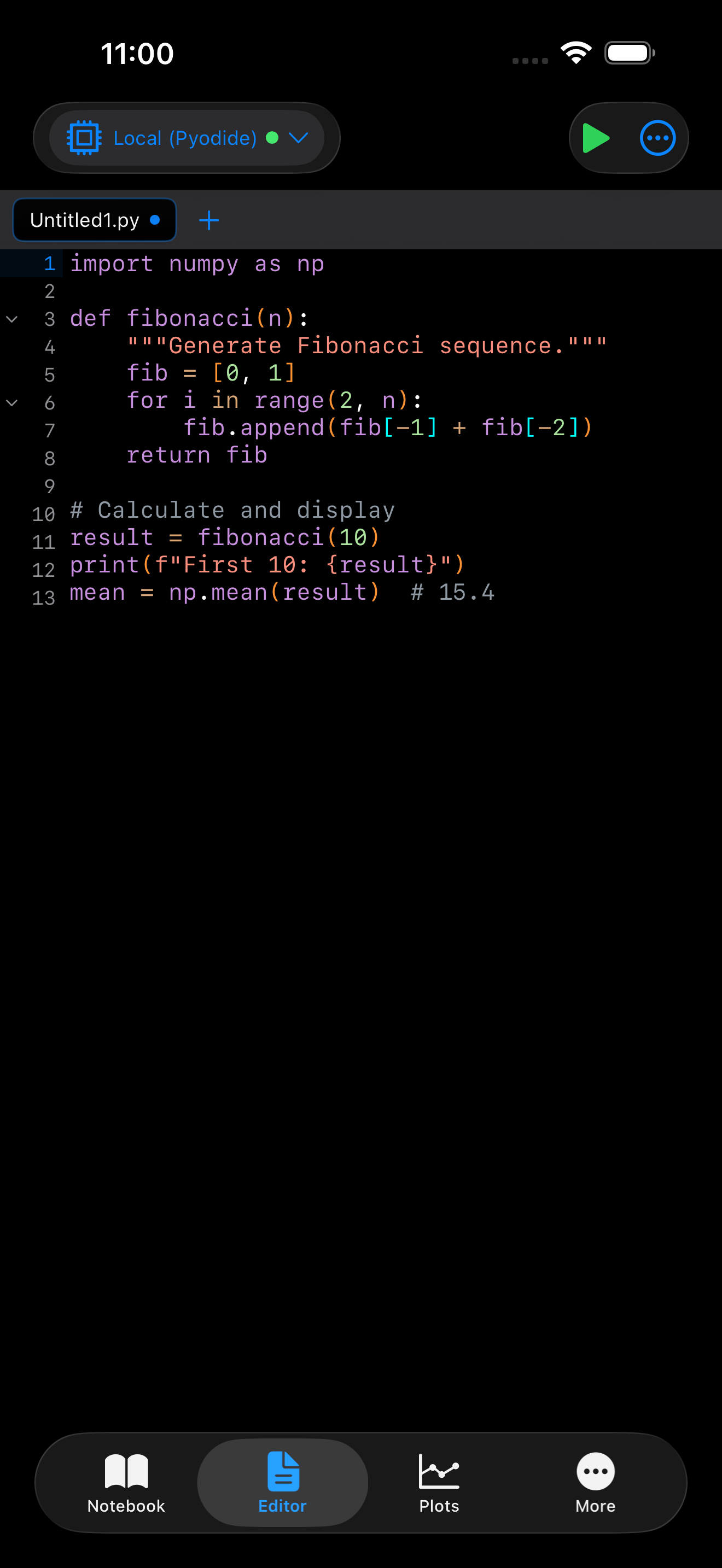
Themes
Pyodios ships with nine built-in color themes and a full theme editor so you can match your coding environment to your taste. Themes control every visible color in the app, from syntax highlighting and the editor background to the toolbar chrome and semantic markers like errors, warnings, and selections.
System Theme Mode
The app follows your device’s appearance by default. You can override this in Settings > Appearance > App Theme:
| Option | Behavior |
|---|---|
| System | Follows your iOS device theme. If your phone is set to dark mode, Pyodios uses dark mode too. |
| Light | Always uses light colors regardless of your system setting. |
| Dark | Always uses dark colors regardless of your system setting. |
The change takes effect immediately. No restart needed.
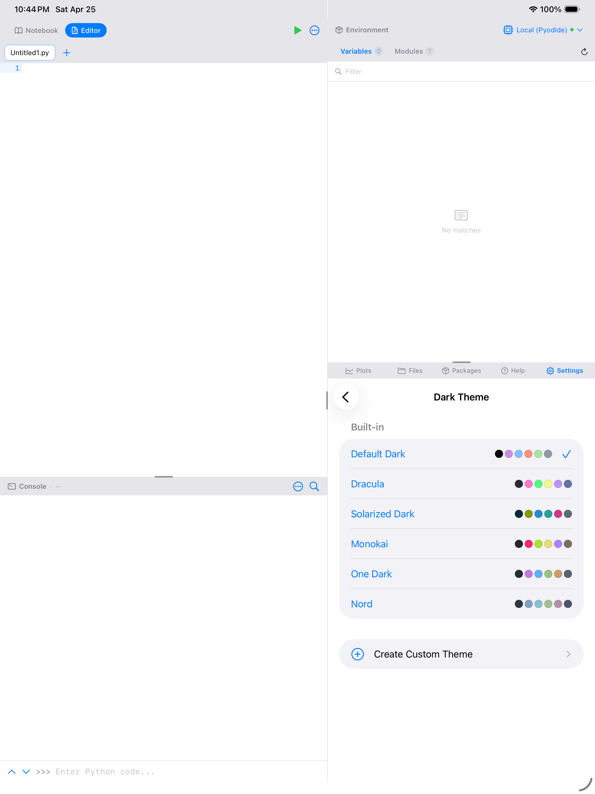
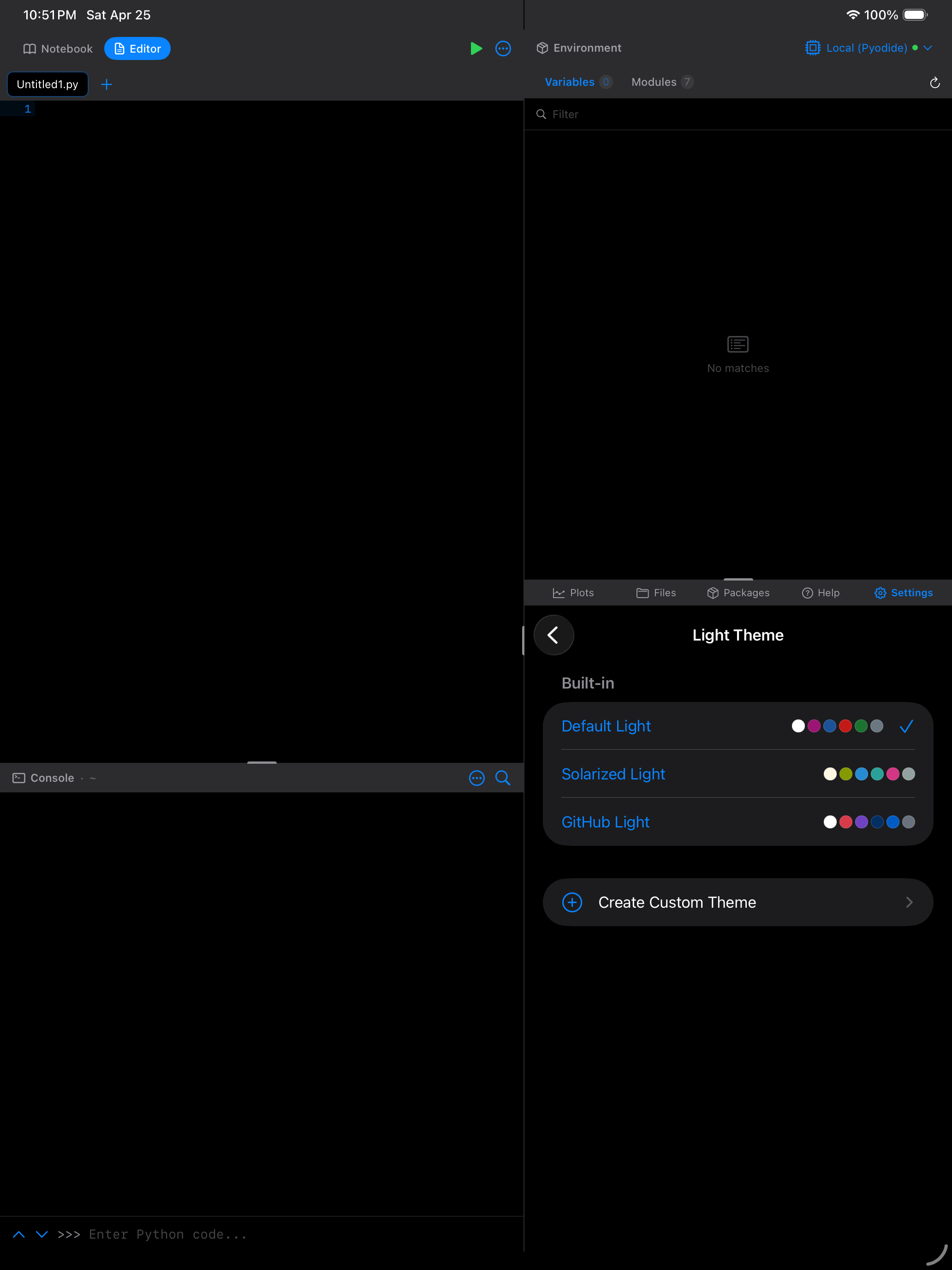
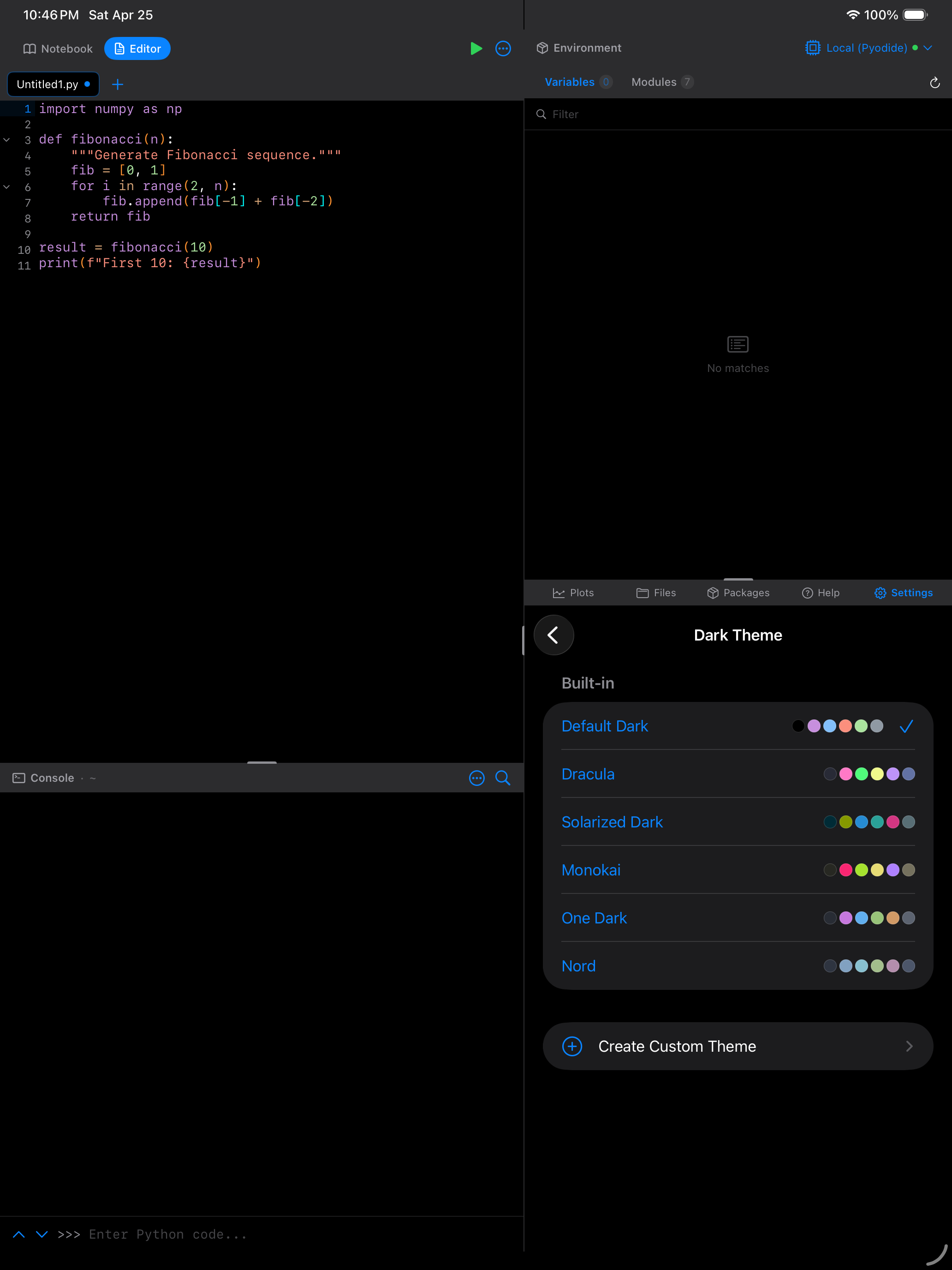
Built-in Themes
Pyodios includes nine themes organized by mode. Each theme defines colors for the editor, console, syntax highlighting, and the rest of the UI.
Light Themes
A clean, neutral palette with blue accents. The standard starting point.
Ethan Schoonover’s warm, low-contrast palette designed for long reading sessions.
Modeled on the GitHub code view. Familiar if you spend time reading code on the web.
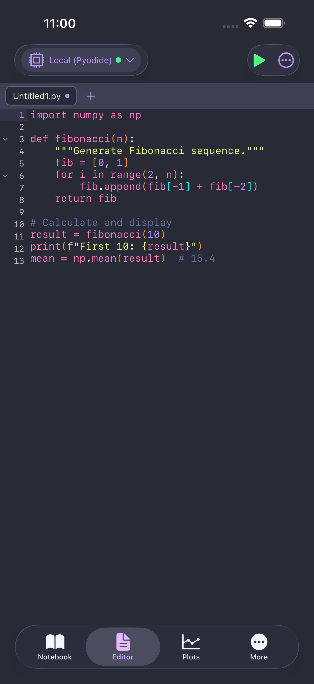
Dark Themes
A balanced dark palette with comfortable contrast and blue accents.
Rich purples and greens on a deep background. Popular across editors for its high readability.
The dark counterpart to Solarized Light, with the same carefully tuned color relationships.
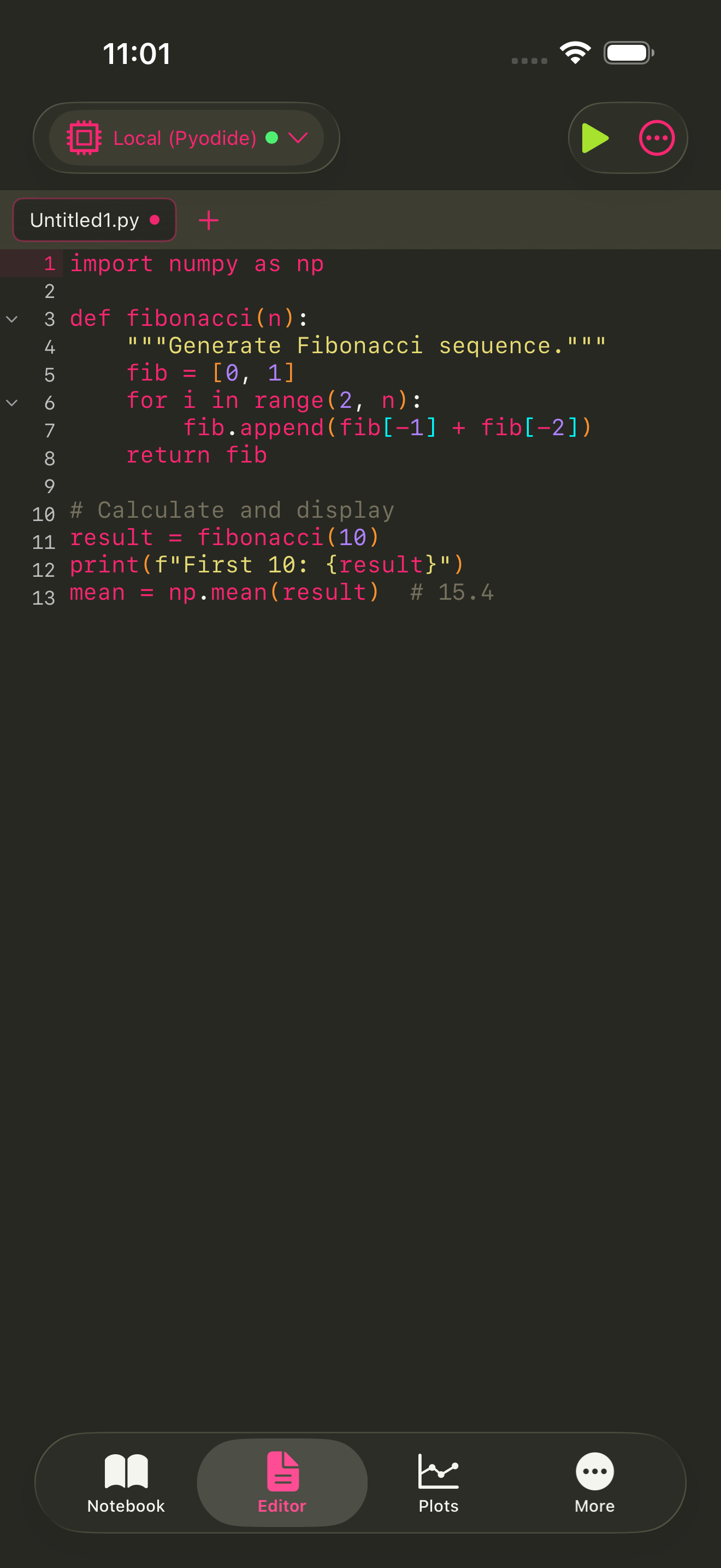
Vivid yellows, pinks, and greens inspired by the classic Sublime Text theme.
Atom editor’s signature dark theme. Balanced, professional, easy to scan.
Cool blue-gray tones from the Arctic Ice Studio palette. Calm and focused.
Choosing a Theme
You can assign a different theme for light mode and dark mode independently. This means you can use GitHub Light during the day and Dracula at night, and Pyodios will switch automatically when your system mode changes.
To choose a theme:
- Open Settings > Appearance
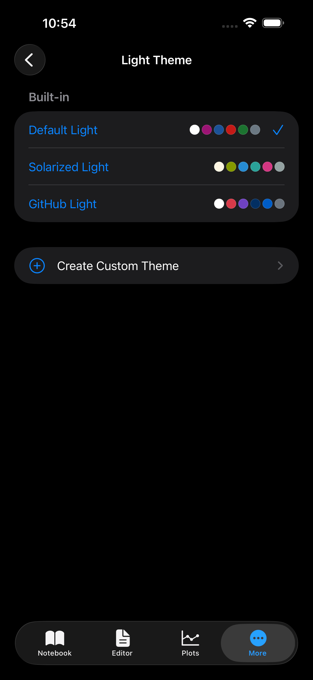
- Tap Light Theme or Dark Theme to open the theme picker
- Each row shows the theme name and six color swatches representing its key colors (background, keyword, function, string, number, comment)
- Tap a row to select it. The change applies immediately.
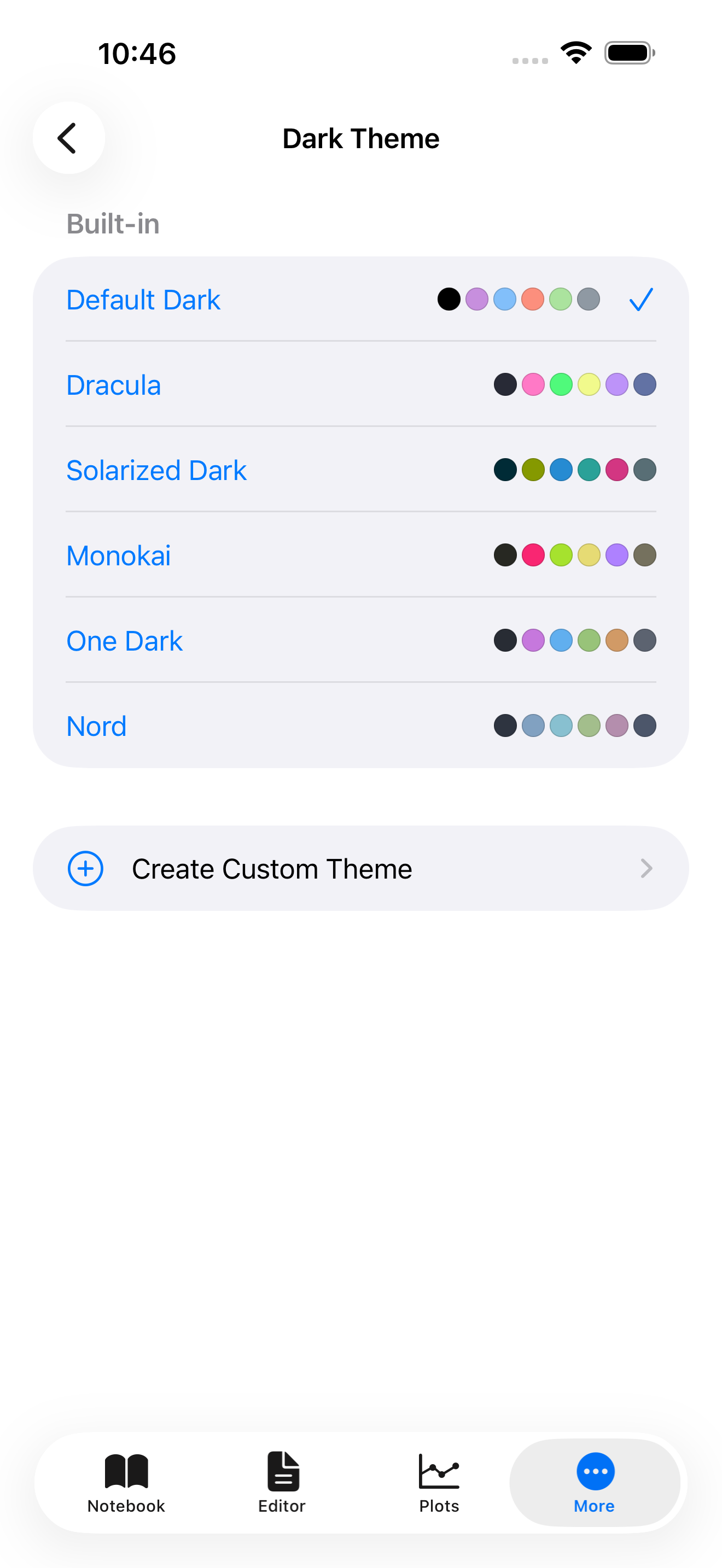
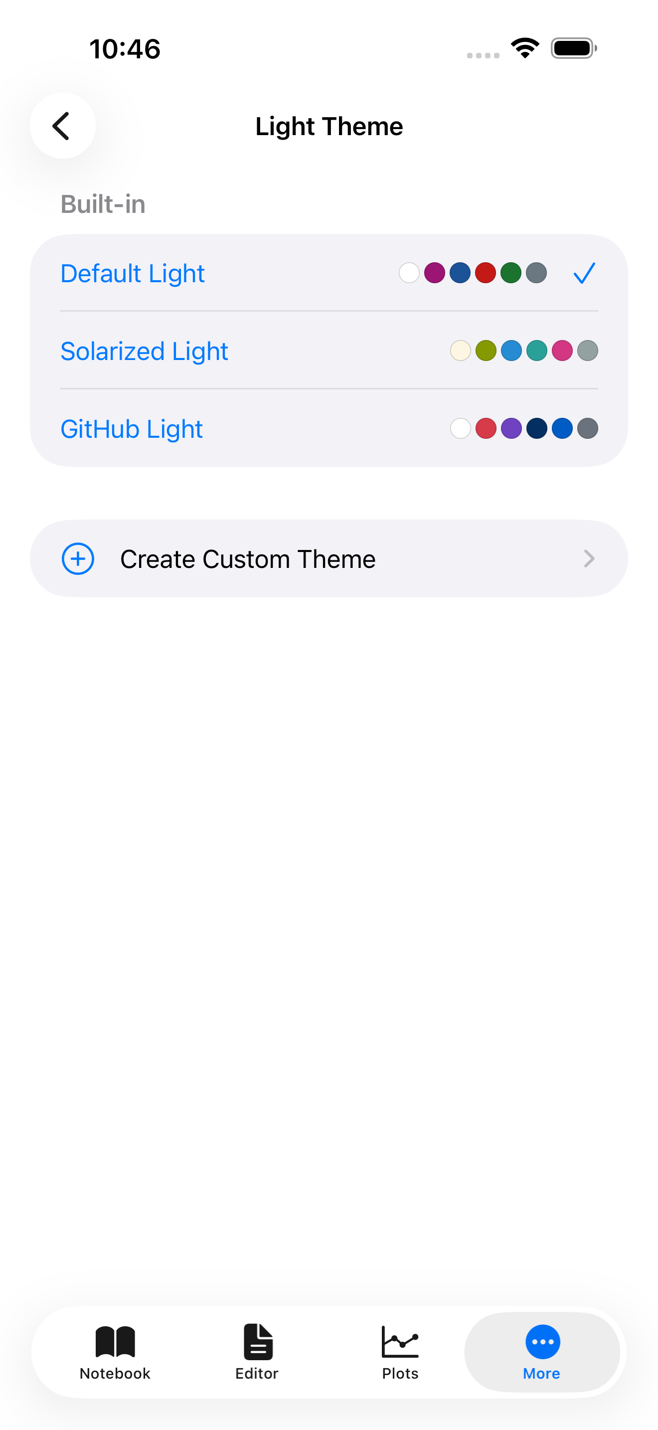
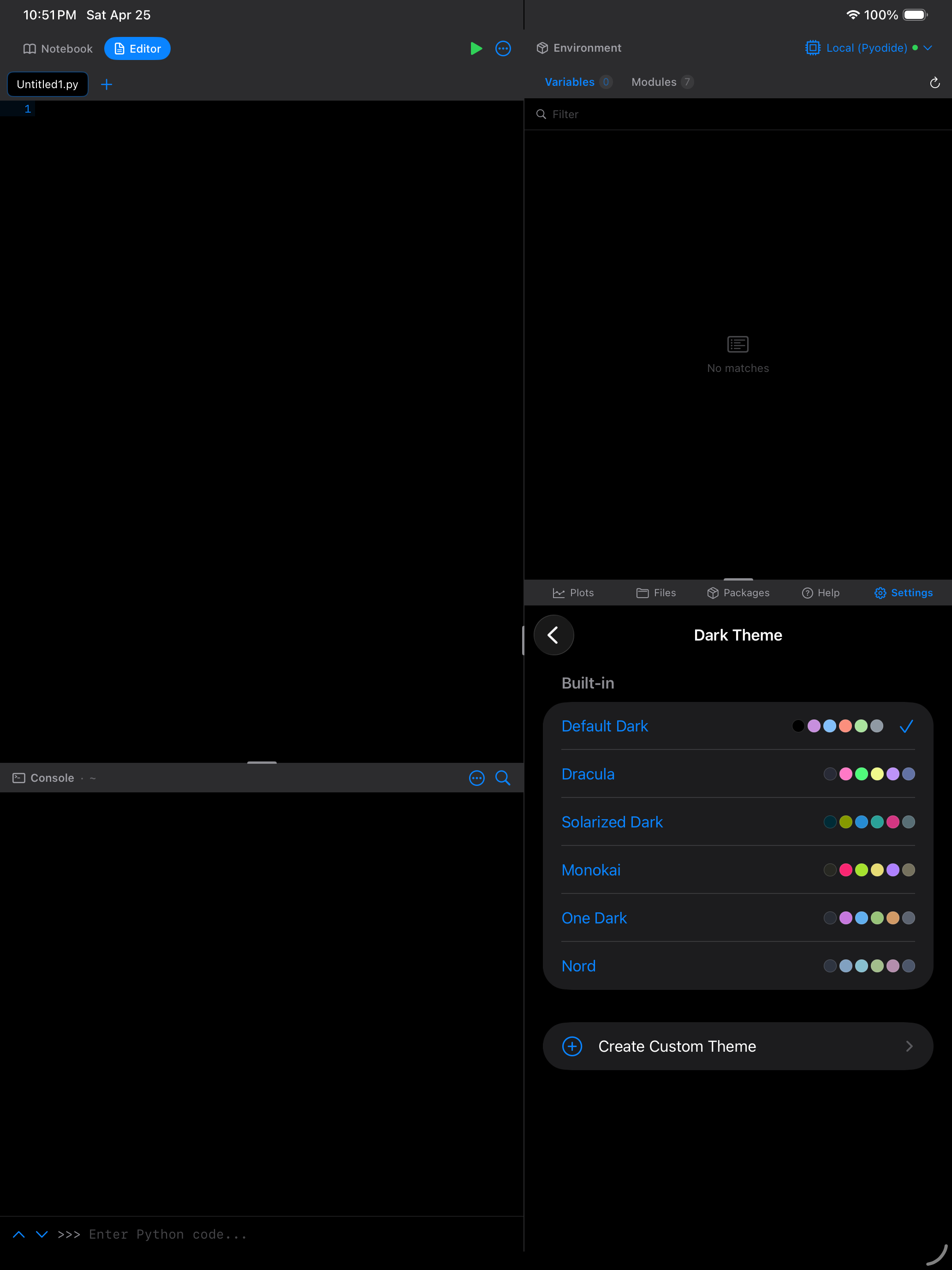
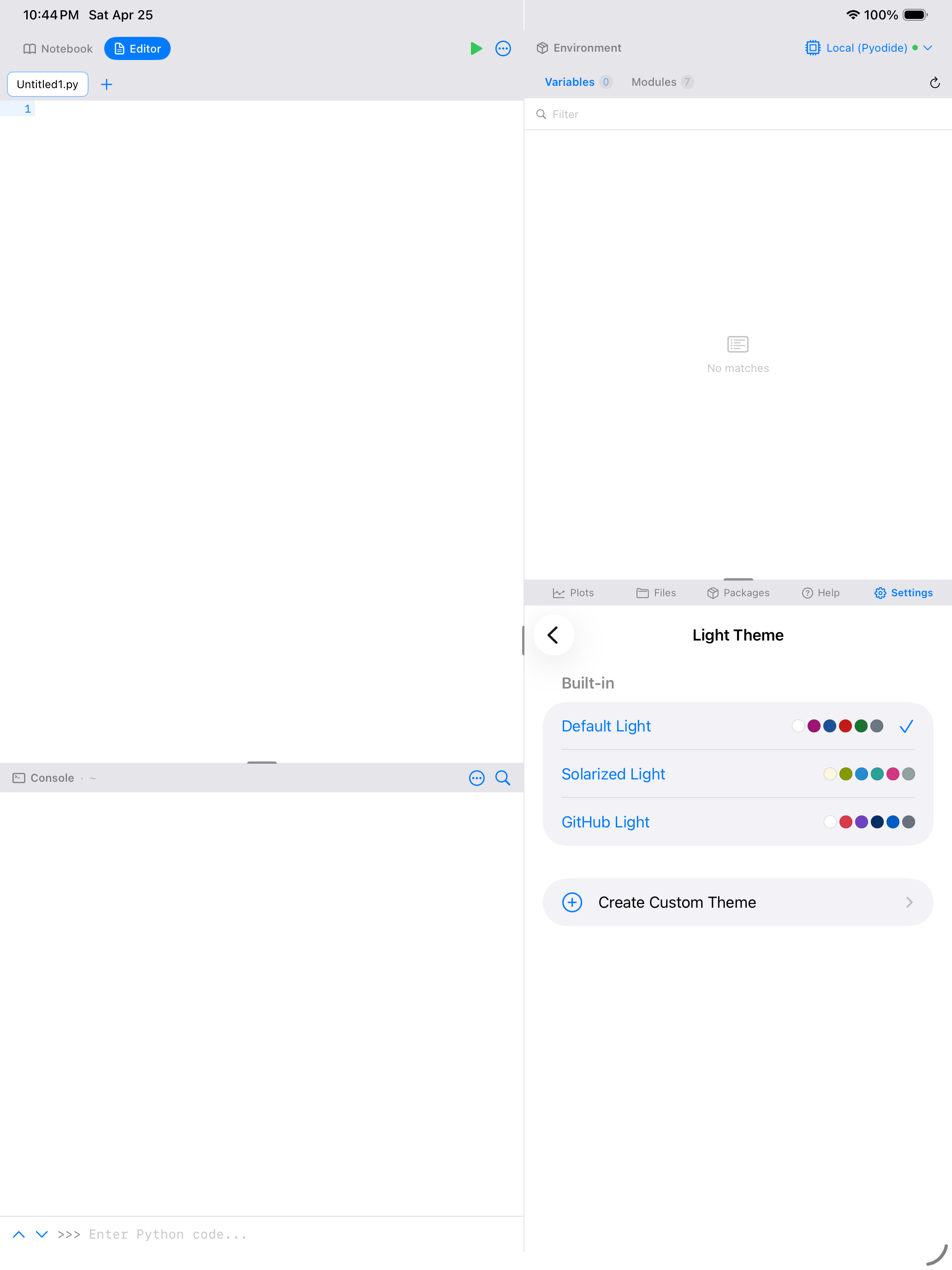
The six color swatches next to each theme name give you a quick preview without switching. Look for colors that match your preferences before tapping.
What a Theme Controls
Every theme defines colors across five categories:
| Category | What it styles |
|---|---|
| Syntax | Keywords, functions, strings, numbers, comments, operators, and plain text in the code editor |
| UI | Primary/secondary/tertiary backgrounds, text colors, accent color, separators, and selection highlight |
| Editor | Editor background, current-line highlight, gutter background, and gutter text |
| Console | Standard output, standard error, input echo, and prompt colors |
| Semantic | Error (red), warning (orange), success (green), and info (blue) indicators |
This means switching from Default Dark to Dracula doesn’t just change the syntax colors. It re-skins the entire app, including the tab bar, navigation chrome, and output panels.
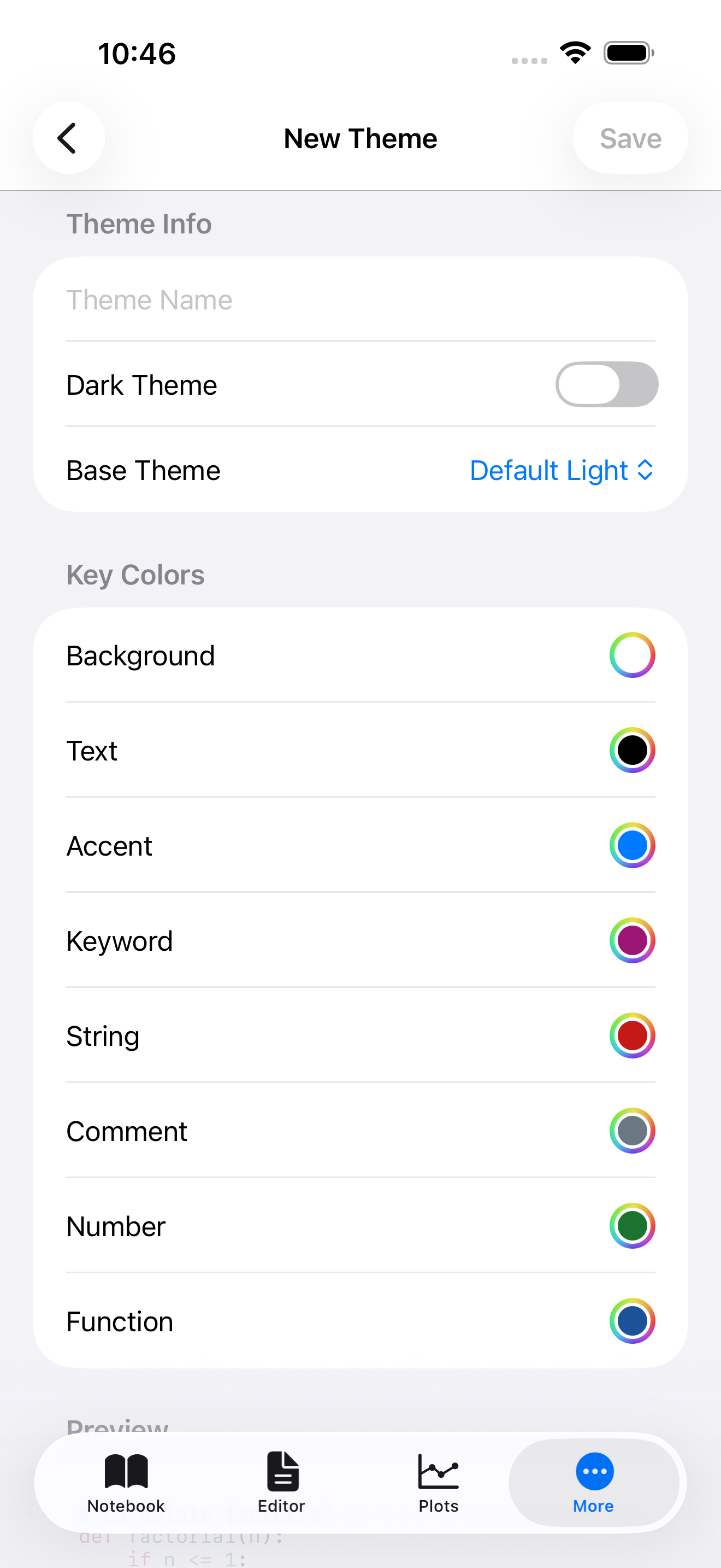
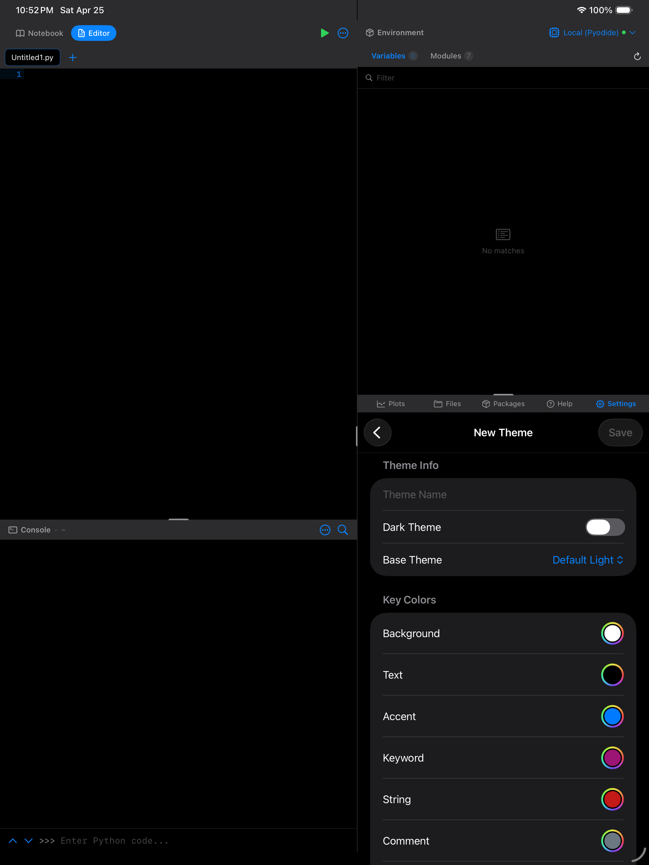
Creating Custom Themes
If none of the built-in themes are quite right, you can create your own.
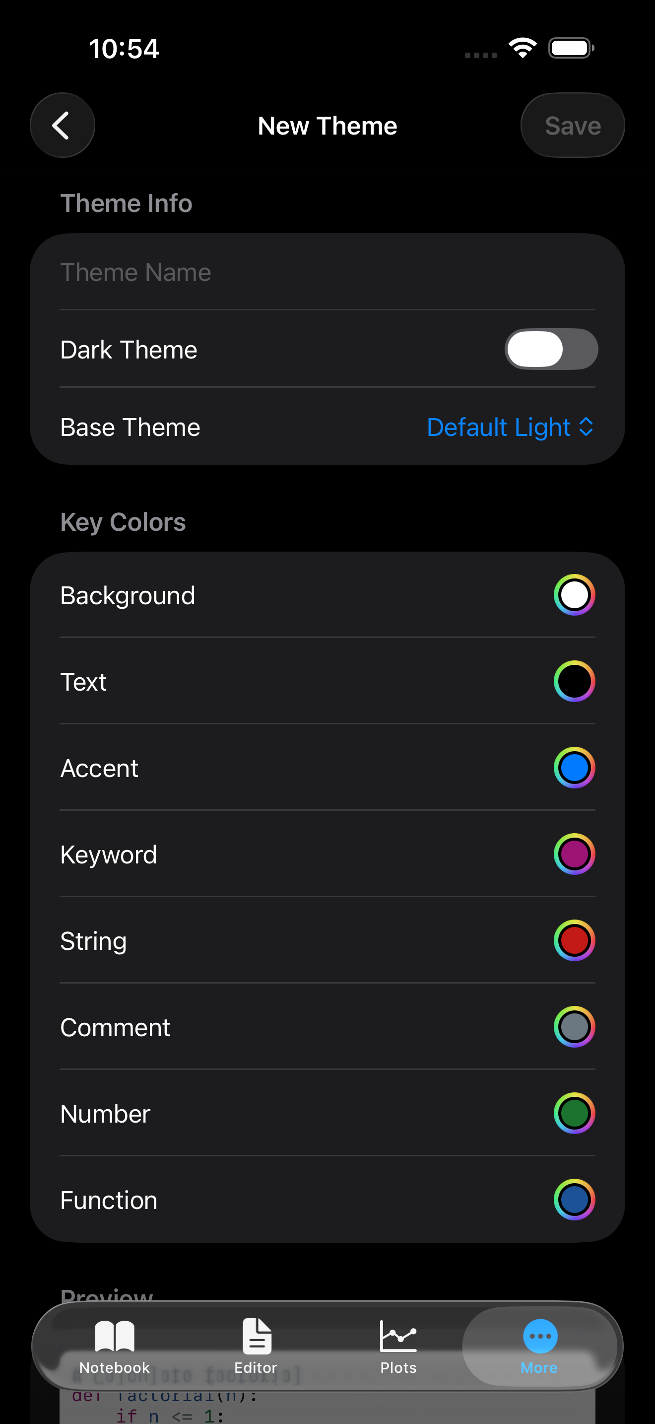
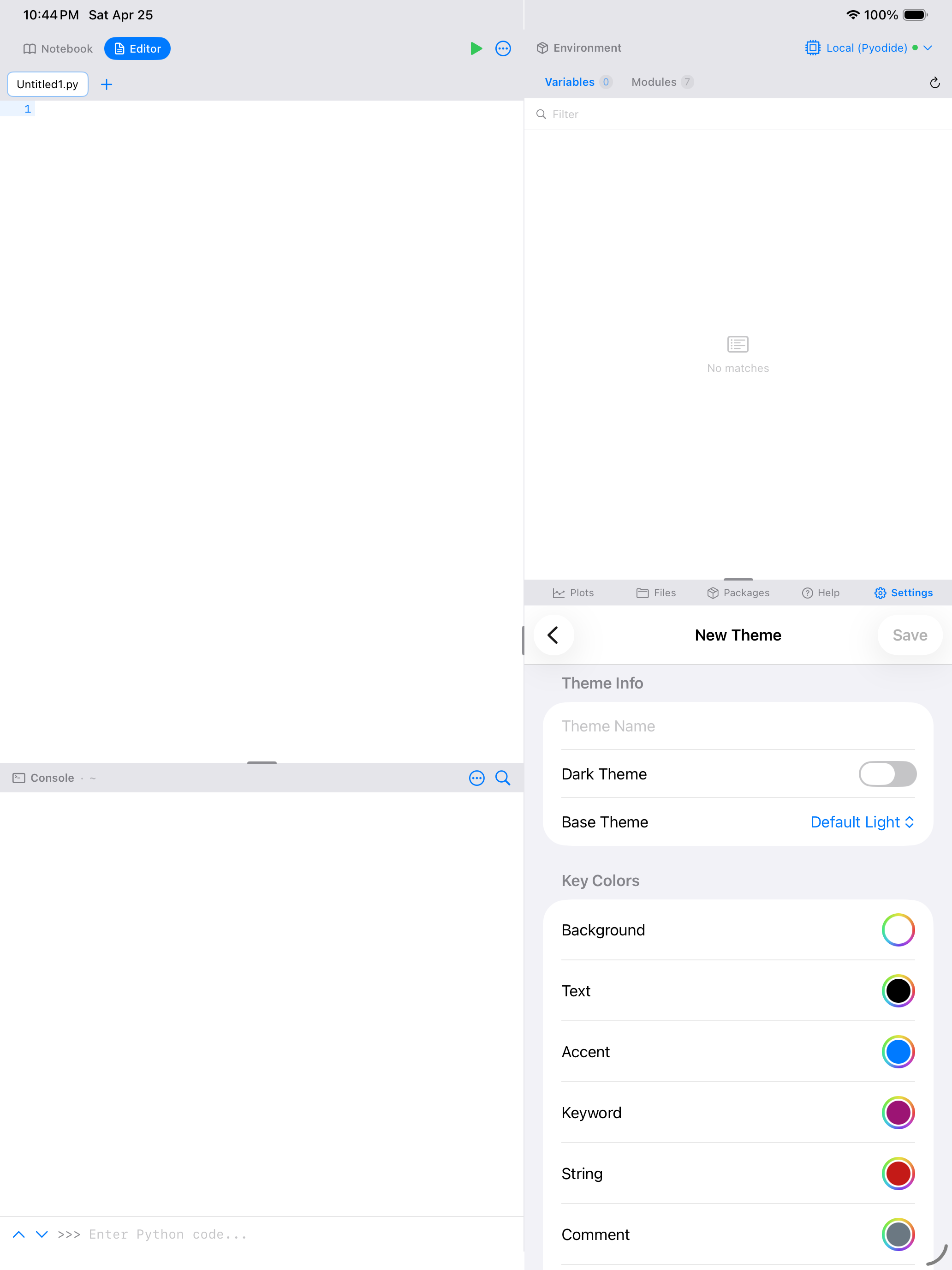
Opening the Theme Editor
- In Settings > Appearance, scroll to the Custom Themes section
- Tap New Theme to open the editor
- Optionally, choose a base theme to start from (clone its colors as a starting point)
Key Colors
The Theme Editor presents eight key colors that define the core look of your theme:
| Color | What it controls |
|---|---|
| Background | Main editor and console background |
| Text | Default text color |
| Accent | UI highlights, buttons, active indicators |
| Keyword | Python keywords like if, for, def, import |
| String | Quoted strings |
| Comment | Code comments |
| Number | Numeric literals |
| Function | Function names and calls |
Tap any color swatch to open the color picker.

Live Preview
As you change colors, a live preview updates in real time. It shows a sample of syntax-highlighted Python code so you can see exactly how your theme will look before saving.
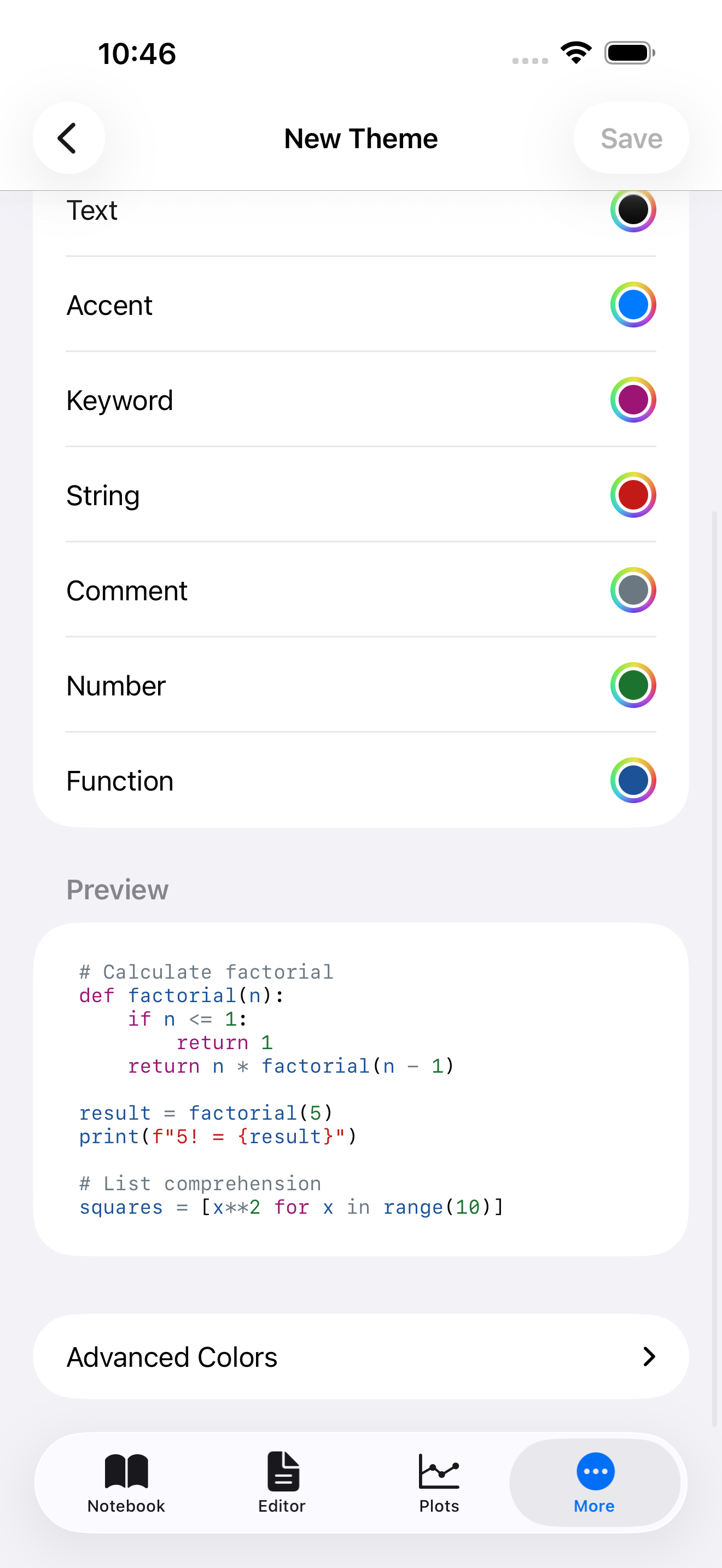
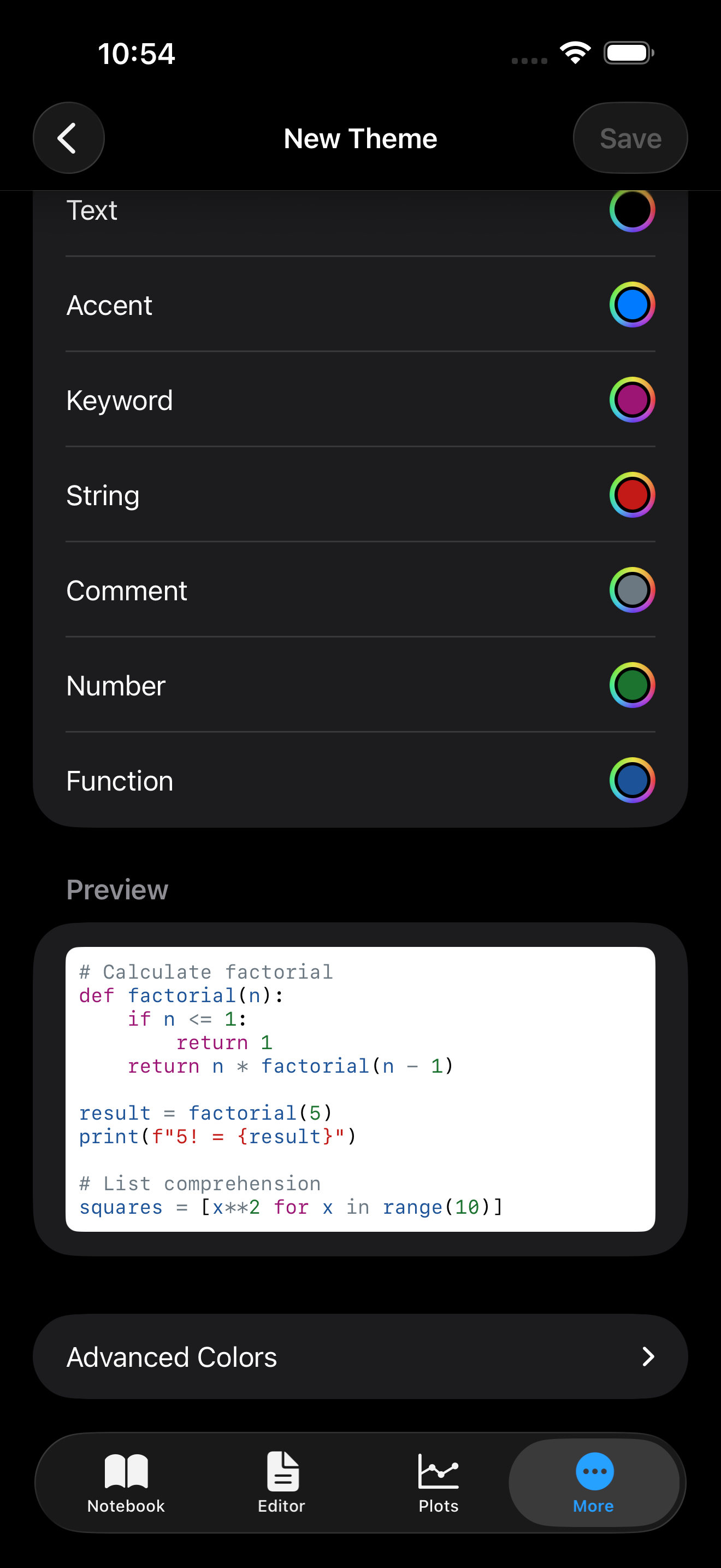

Advanced Colors
Expand the Advanced Colors section to fine-tune more than 20 additional colors, including:
- Secondary and tertiary backgrounds
- Gutter and line highlight colors
- Console prompt, stdout, and stderr colors
- Semantic colors (error, warning, success, info)
- Selection and separator colors
Most of these are automatically derived from your key colors, so you only need to adjust them if you want precise control.
Starting from a base theme that is close to what you want saves a lot of time. If you like Monokai but want a different background color, start from Monokai and adjust just the background. All the other colors will already work well together.
Saving Your Theme
- Enter a name for your theme in the text field at the top
- Set whether the theme is for light or dark mode using the toggle
- Tap Save
Your custom theme appears in the appropriate theme picker (light or dark) and can be selected just like any built-in theme.
Editing and Deleting Custom Themes
Custom themes appear in the Custom Themes list under Settings > Appearance.
To edit a custom theme, tap it to reopen the Theme Editor with all its colors pre-filled.
To delete a custom theme, swipe left and tap Delete. If the deleted theme was your active theme, Pyodios falls back to the default theme for that mode.
Built-in themes cannot be edited or deleted. To modify a built-in theme, clone it by selecting it as a base when creating a new custom theme, then adjust the colors.
Importing and Exporting Themes
Importing Themes
Pyodios supports two theme file formats:
| Format | Source | File extension |
|---|---|---|
| Pyodios native | Themes exported from Pyodios, webRoid (Android), or webRios (iOS/R) | .json |
| VS Code | Export your VS Code color theme as JSON | .json |
To import a theme:
- In Settings > Appearance, scroll to the Custom Themes section
- Tap Import Theme
- Choose From File to pick a
.jsonfile from Files, iCloud Drive, or any connected storage; or From Clipboard if you copied the JSON text
The importer automatically detects the format and maps colors to Pyodios’s palette. If the imported theme doesn’t define every color, missing values are derived from the colors that are present.
If you have a favorite VS Code theme, you can bring it into Pyodios. The mapping handles most themes well, though highly customized themes may need minor adjustments in the Theme Editor after import.
Example Theme
Here is a sample custom theme in Pyodios’s native JSON format. You can copy this, paste it into a .json file, and import it to try the flow:
{
  "id": "autumn-harvest-example",
  "name": "Autumn Harvest",
  "isDark": true,
  "isBuiltIn": false,
  "palette": {
    "syntax": {
      "keyword": "#E07B39",
      "function": "#D4A843",
      "string": "#C4652A",
      "number": "#B8A44C",
      "comment": "#7A6B5D",
      "operator": "#CC8B55",
      "text": "#E8DCC8"
    },
    "ui": {
      "primaryBackground": "#1E1610",
      "secondaryBackground": "#2A2017",
      "tertiaryBackground": "#362A1E",
      "primaryText": "#E8DCC8",
      "secondaryText": "#9C8B78",
      "accent": "#E07B39",
      "separator": "#3D2F22",
      "selection": "#E07B3933"
    },
    "semantic": {
      "error": "#D94F3B",
      "warning": "#E0A030",
      "success": "#7BAF52",
      "info": "#5A9EC4"
    },
    "console": {
      "stdout": "#E8DCC8",
      "stderr": "#D94F3B",
      "input": "#D4A843",
      "prompt": "#E07B39"
    },
    "editor": {
      "background": "#1E1610",
      "lineHighlight": "#2A2017",
      "gutterBackground": "#171009",
      "gutterText": "#7A6B5D"
    }
  }
}
This JSON format is identical across Pyodios, webRoid (Android), and webRios (iOS/R). A theme exported from any one of them can be imported into the others.
Exporting Themes
To share a custom theme:
- Find it in the Custom Themes list
- Tap the share icon next to it
- Choose where to save or share the JSON file
Exported themes use Pyodios’s native JSON format and can be imported on another device or shared with other users.
Accent Color
Each theme defines its own accent color (for example, Dracula uses purple and Monokai uses pink). By default, the app uses the theme’s accent for all interactive elements: buttons, toggles, tab bar highlights, and the run button.
If you want to override the theme’s accent with a specific color, open Settings > Appearance and choose from the five options at the bottom:
- Default (no override, uses the theme’s own accent)
- Blue
- Purple
- Orange
- Green
- Red
The override applies on top of whatever theme you are using, so you can pair Dracula’s dark syntax with an orange accent for a distinctive look. To go back to the theme’s natural accent, deselect the override.
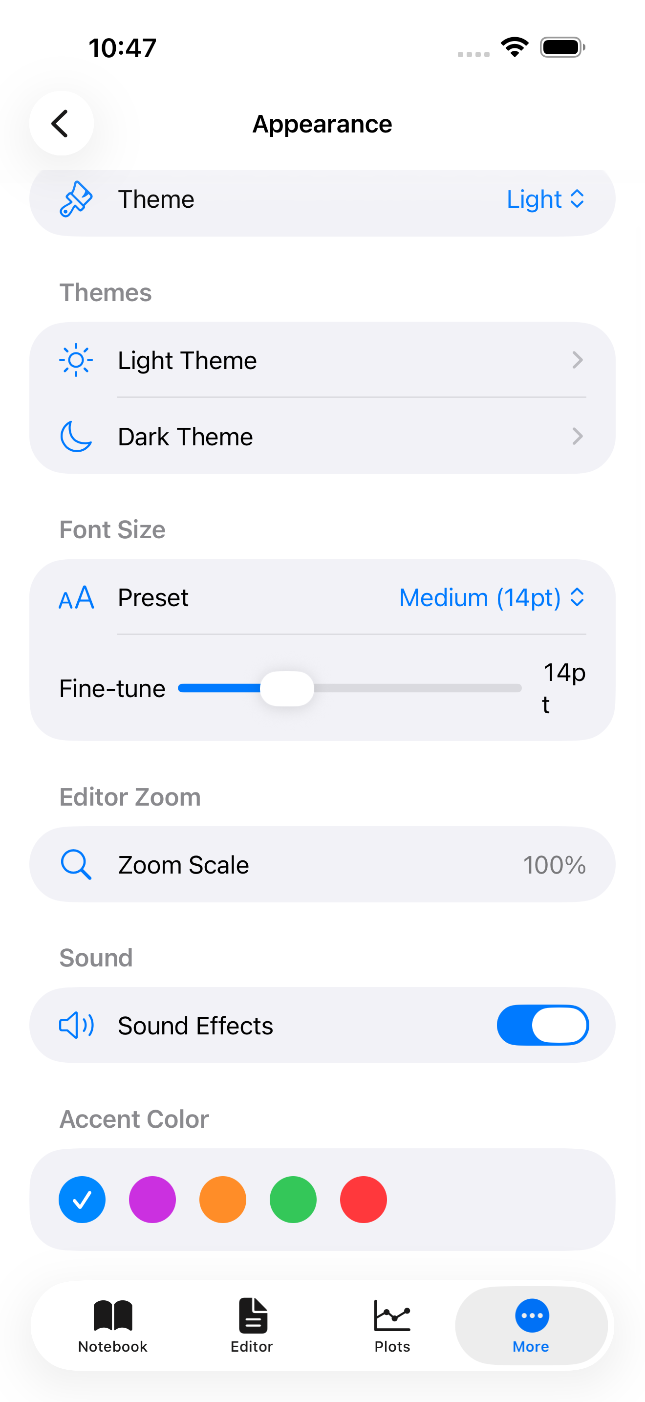
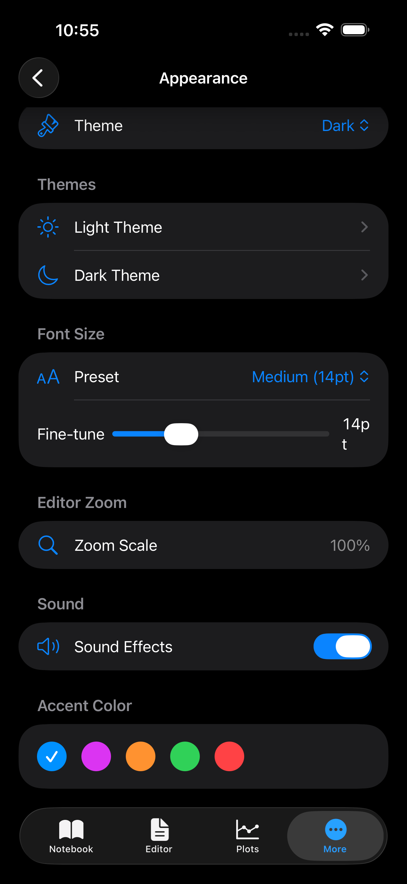
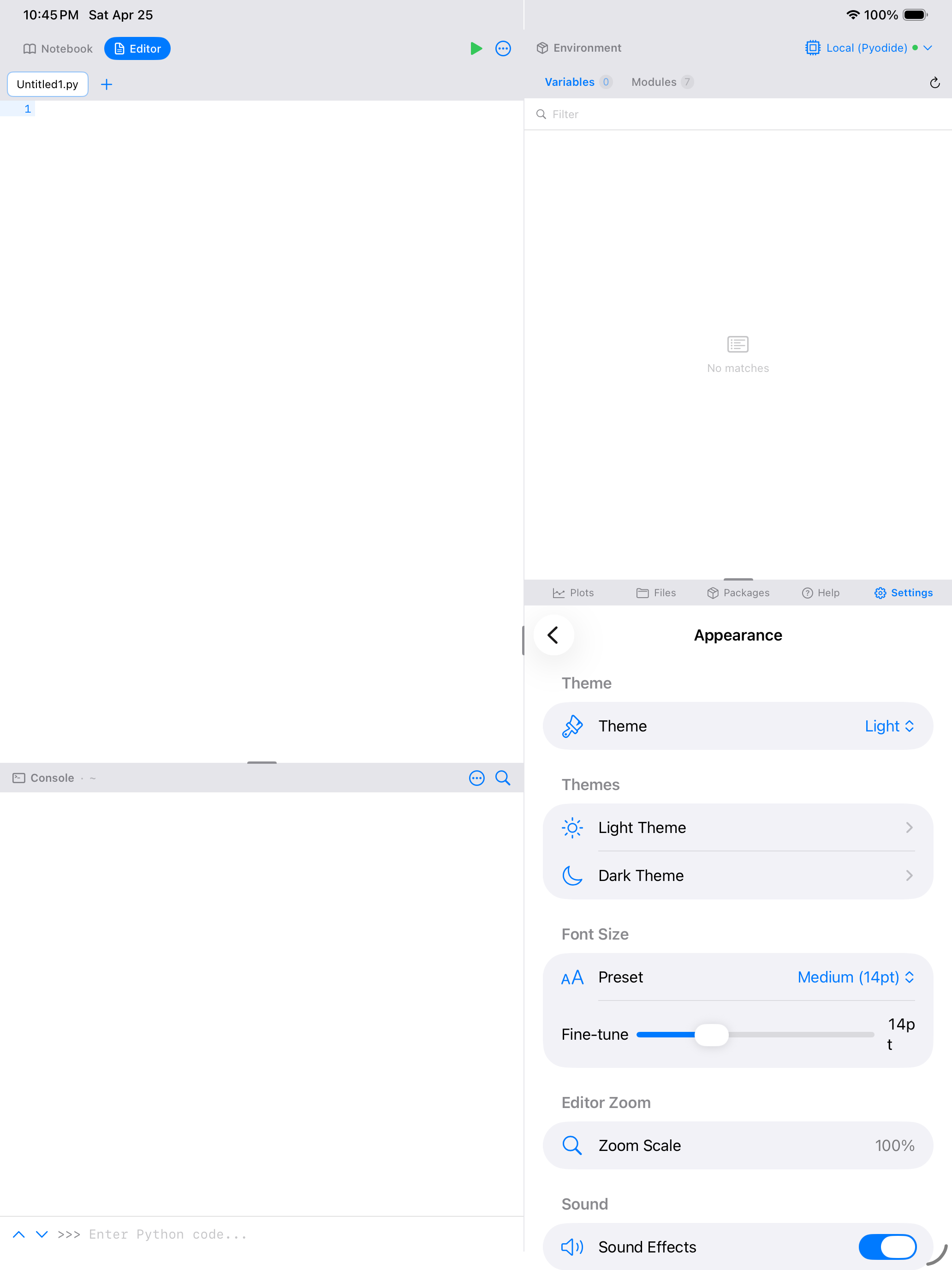
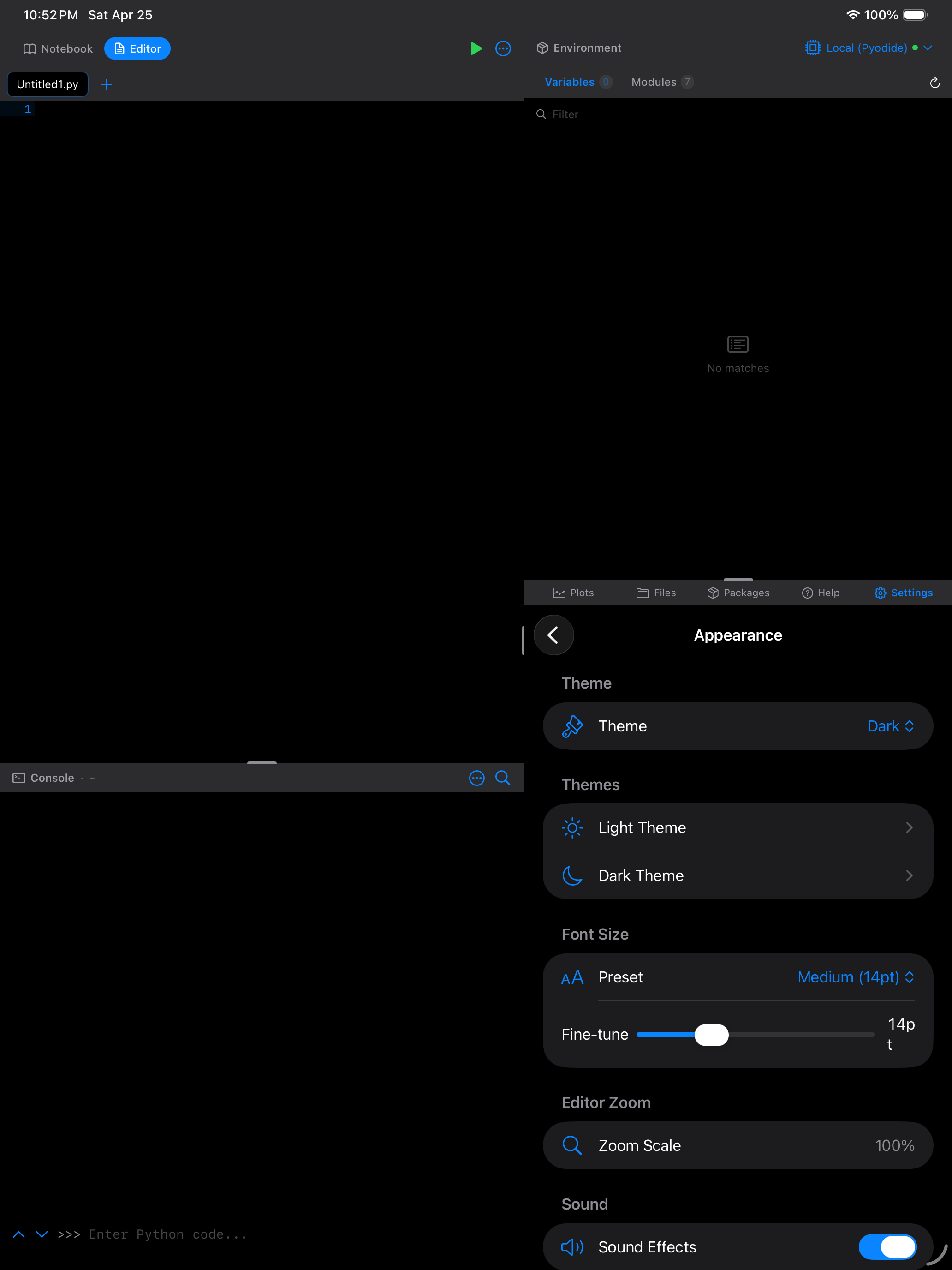
Font Size
The code font size affects the Editor, Console, and Notebook simultaneously. Quick presets are available:
| Preset | Size |
|---|---|
| Small | 11 pt |
| Default | 14 pt |
| Large | 17 pt |
| Extra Large | 20 pt |
A fine-tuning slider lets you pick any value between 10 and 24 pt. The current size is shown next to the slider so you can dial in exactly what you want.
On iPad with an external display, you may want a larger font size than on iPhone. The setting syncs across devices if iCloud Sync is enabled, but you can override it per-device in Settings.
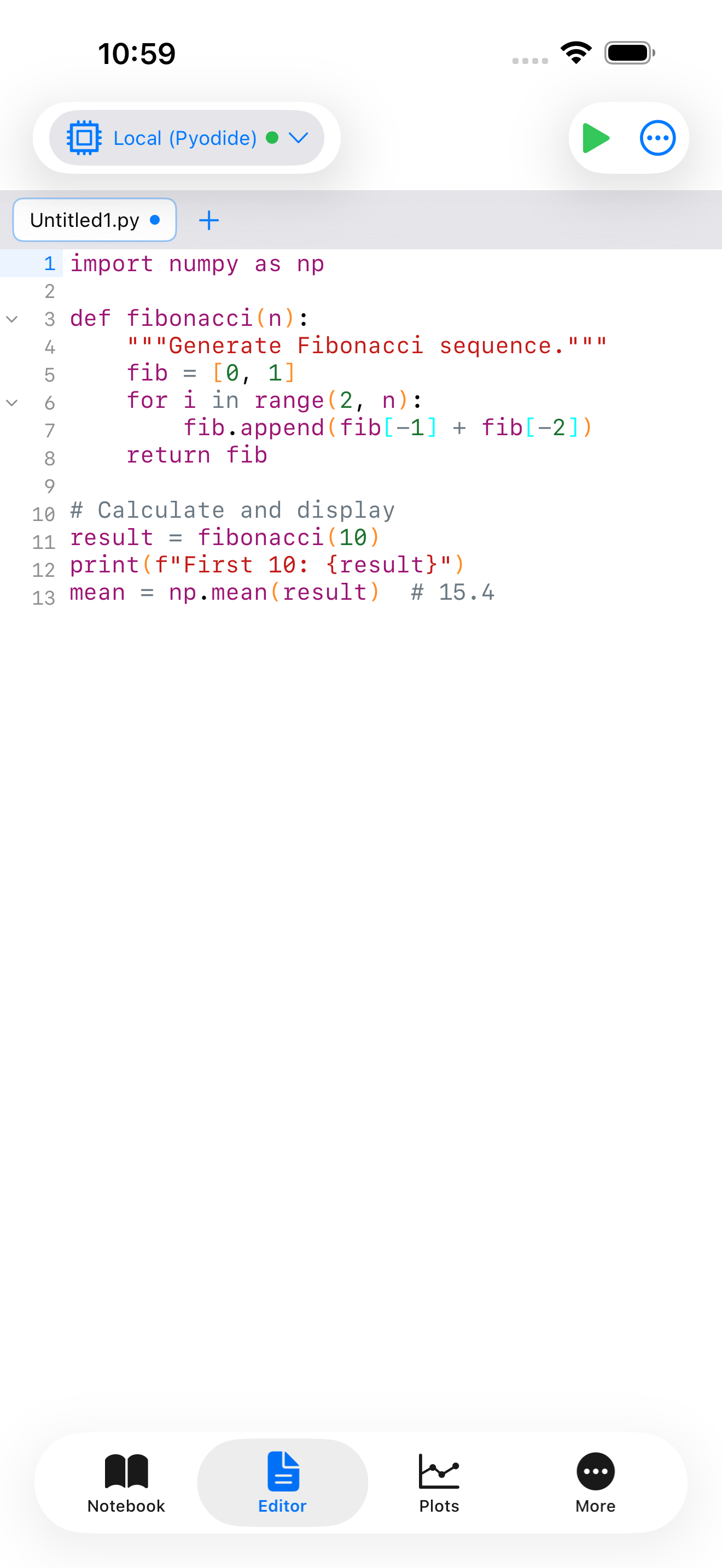
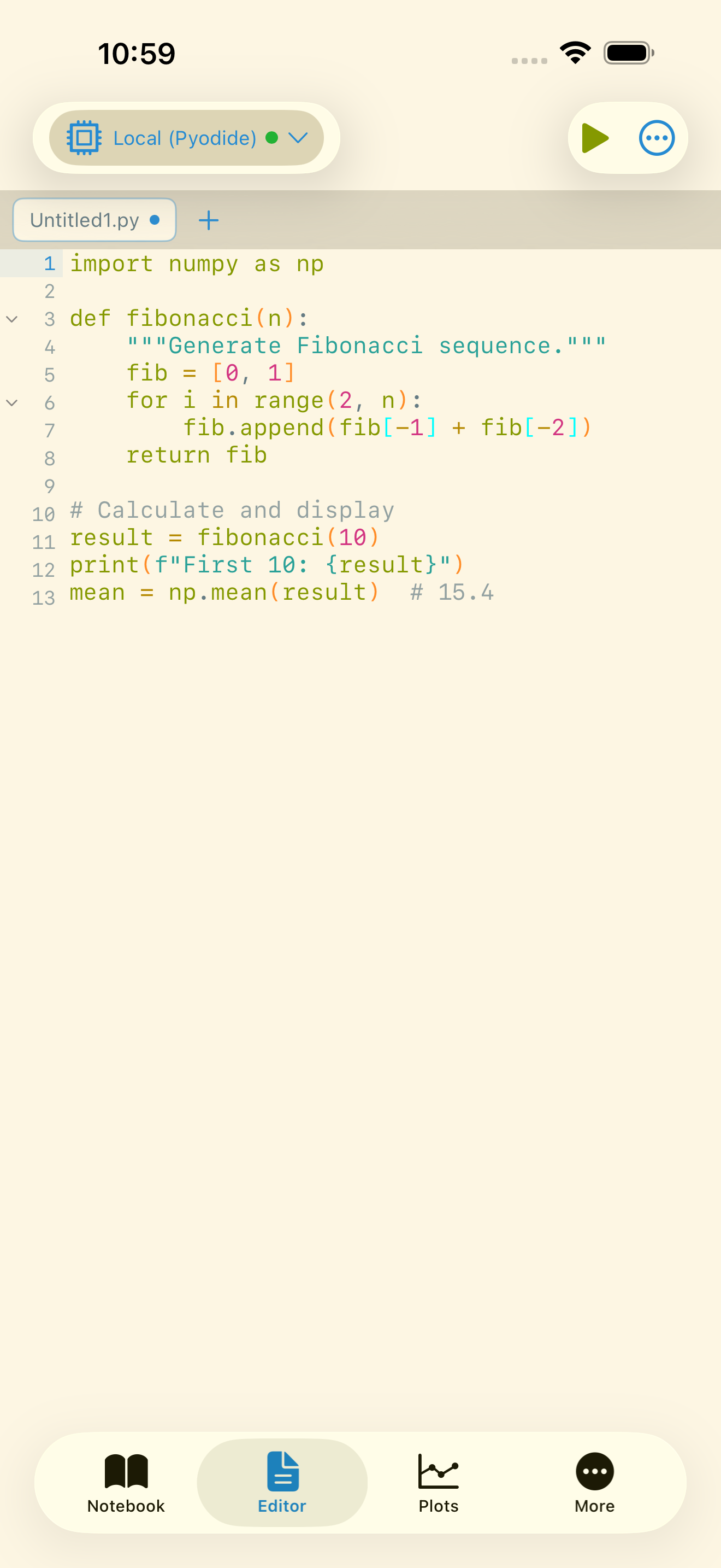
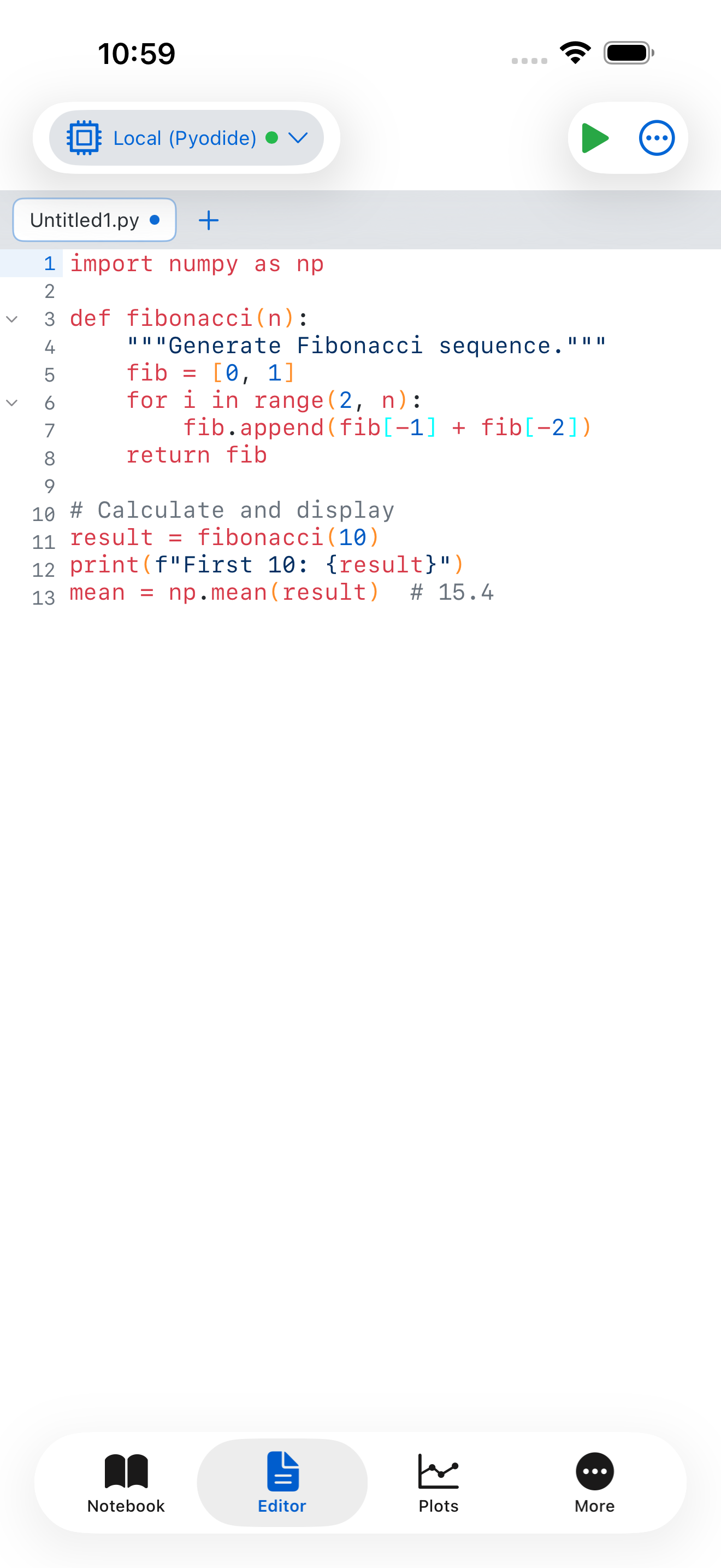
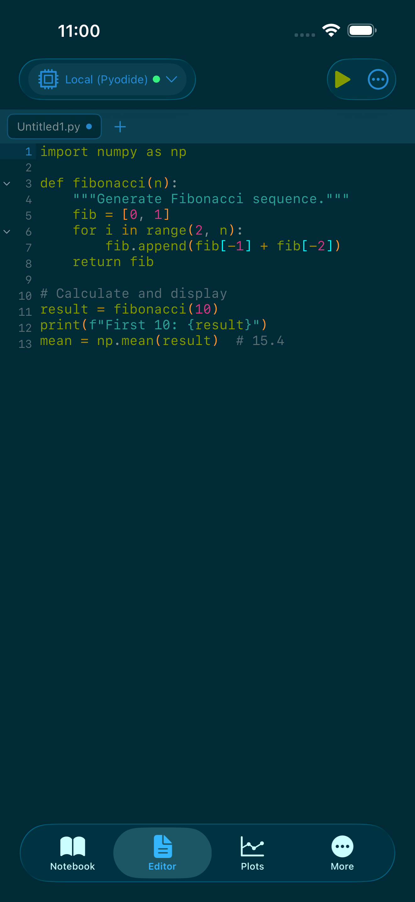
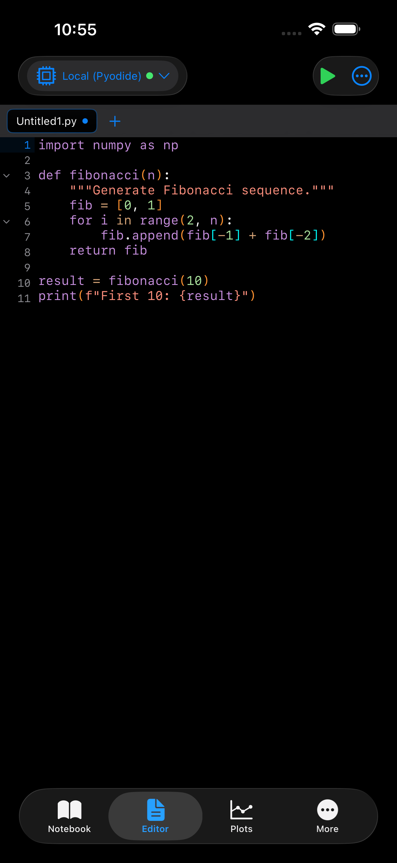
Themes in Action
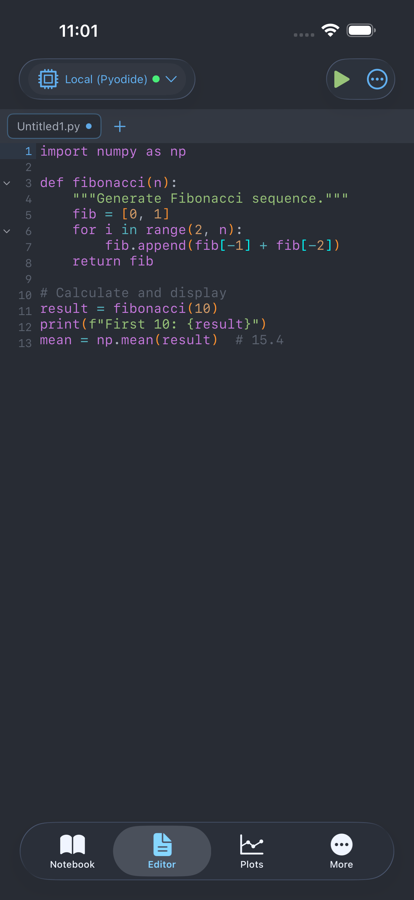
Here is the Editor with the Dracula theme applied, showing how the vivid purples, greens, and cyans look on real Python code:


Plot Background
The Plot Background setting (in Settings > Appearance) controls the background color behind matplotlib and other plots:
| Option | Behavior |
|---|---|
| Match Theme | Plots use your theme’s background color. Best for visual consistency. |
| White | Plots always render on a white background, regardless of your theme. Matches how plots look in desktop Python. |
| Dark | Plots render on a dark background. |
| Gray | Neutral gray background, useful for plots with transparent areas. |
This setting only affects how plots are displayed in the app. Exported plot images use whatever background the matplotlib figure specifies.